Design System
Before diving into the research and the concept prototype, I started with a basic design system to inform the building blocks for the design of the financial literacy app.
Case Study
01 Intro
Creating a design system for a specific product requires that its branding and colors convey optimism, clarity, and the psychology behind making informed decisions.
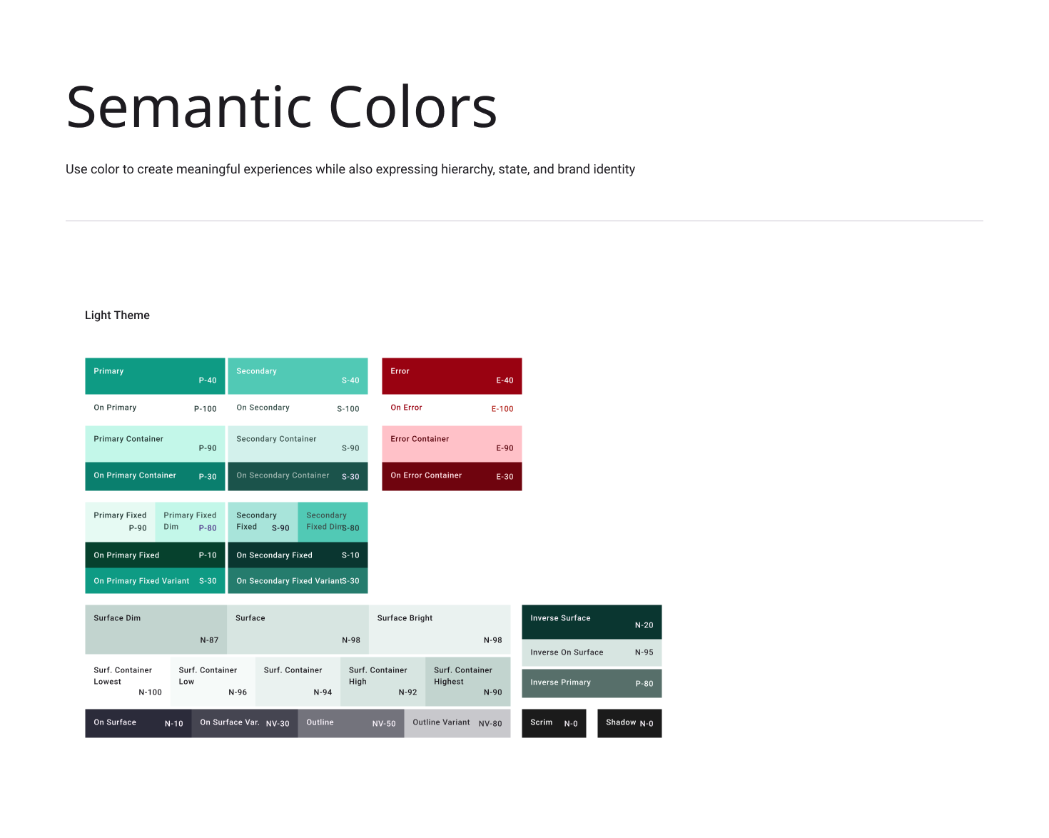
02 Color
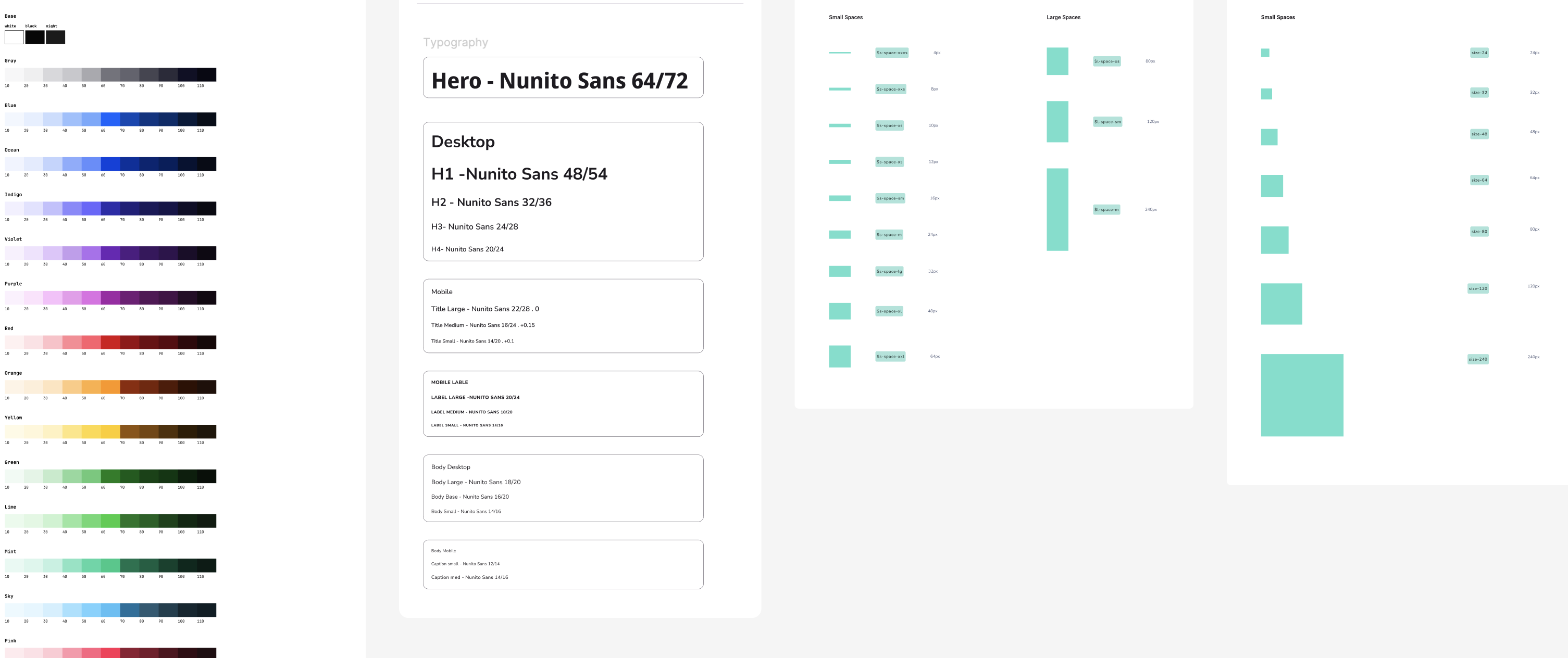
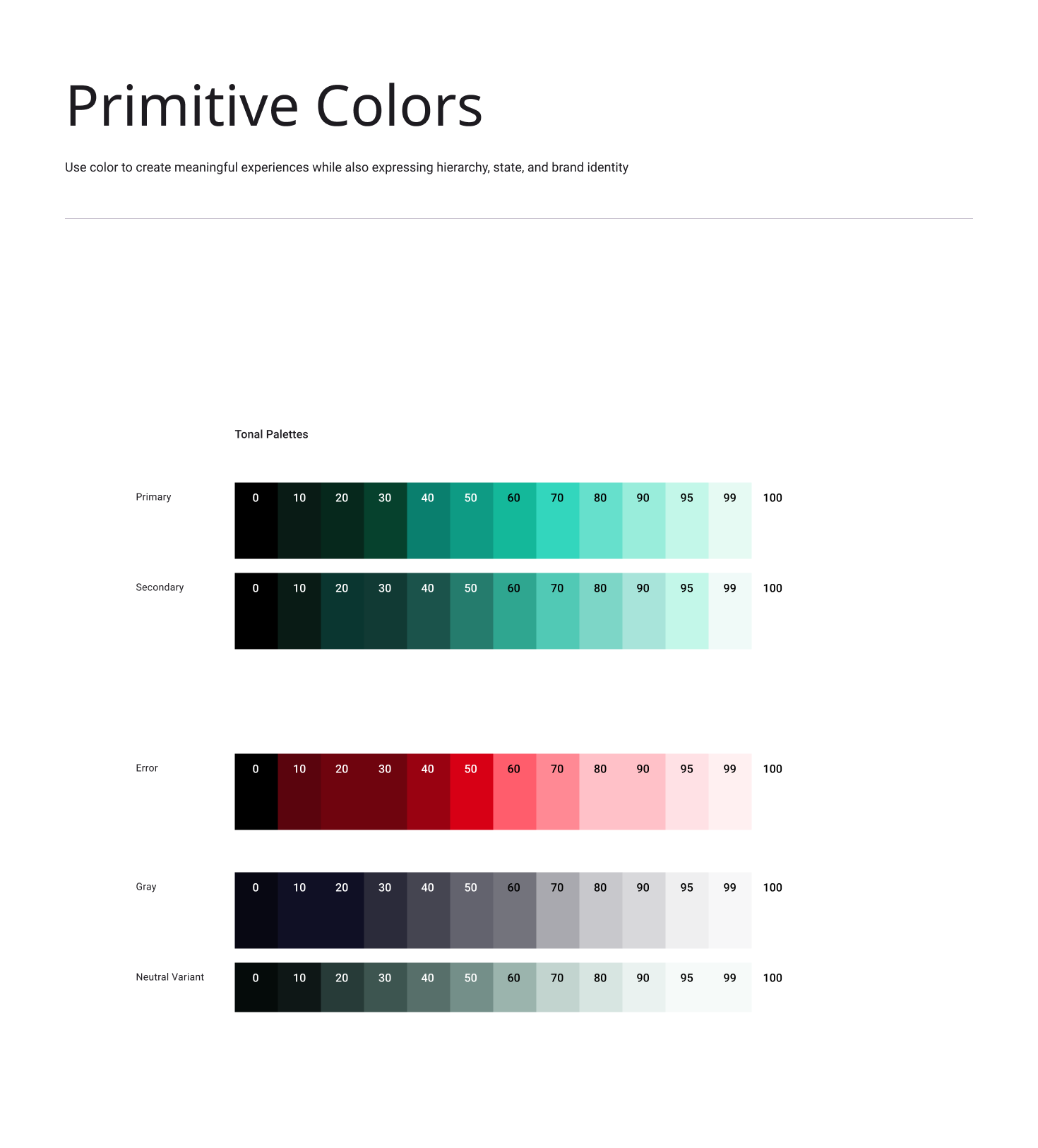
I started playing with different color brands and decided to keep it modern and text accessible. The mint color offers an expanded pallette good for both primary and secondary text and background colors.
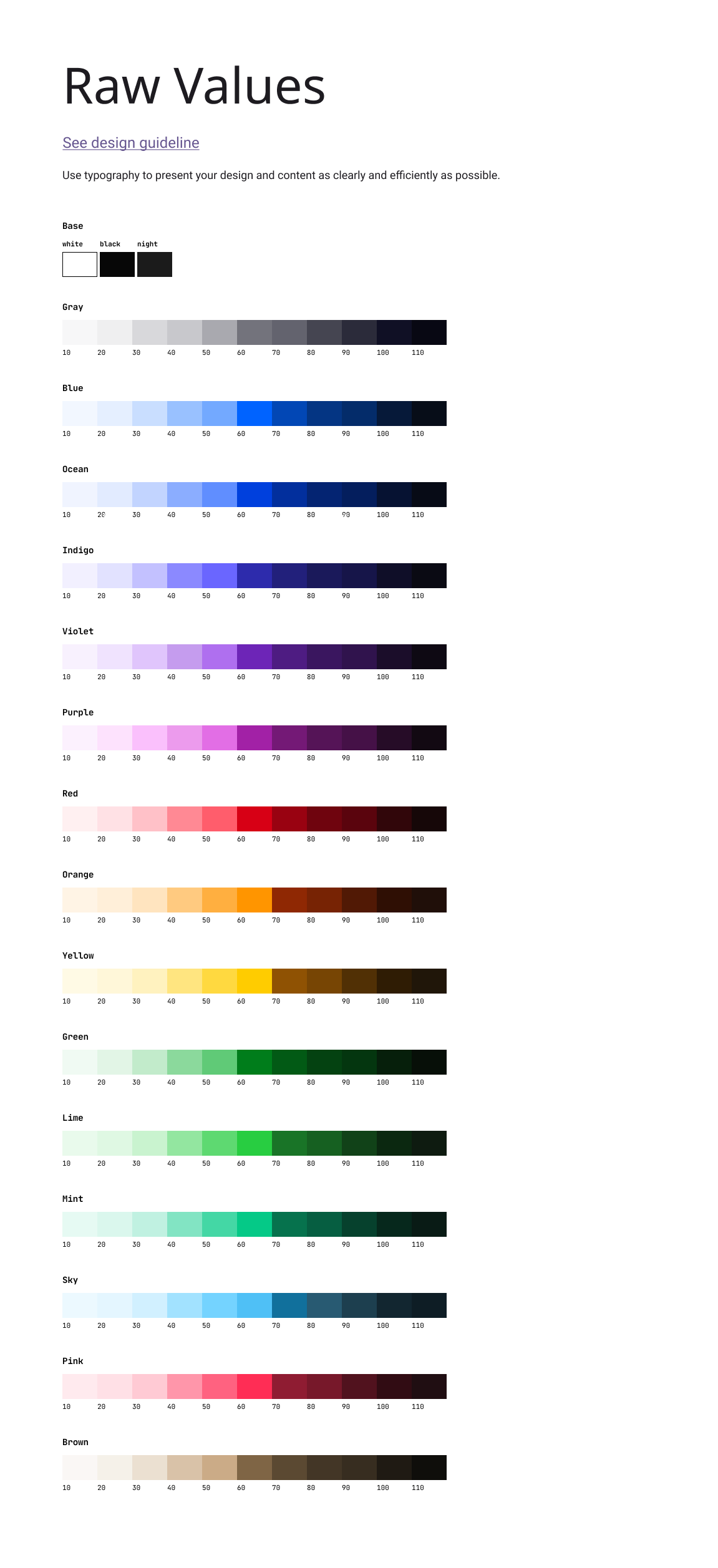
Raw Values
Primary Color Tokens
Semantic Color Tokens
03 Typography
Nunito San’s typography balances clarity and professionalism with a modern yet timeless type pairing, reinforcing our commitment to accuracy, efficiency, and financial stability.
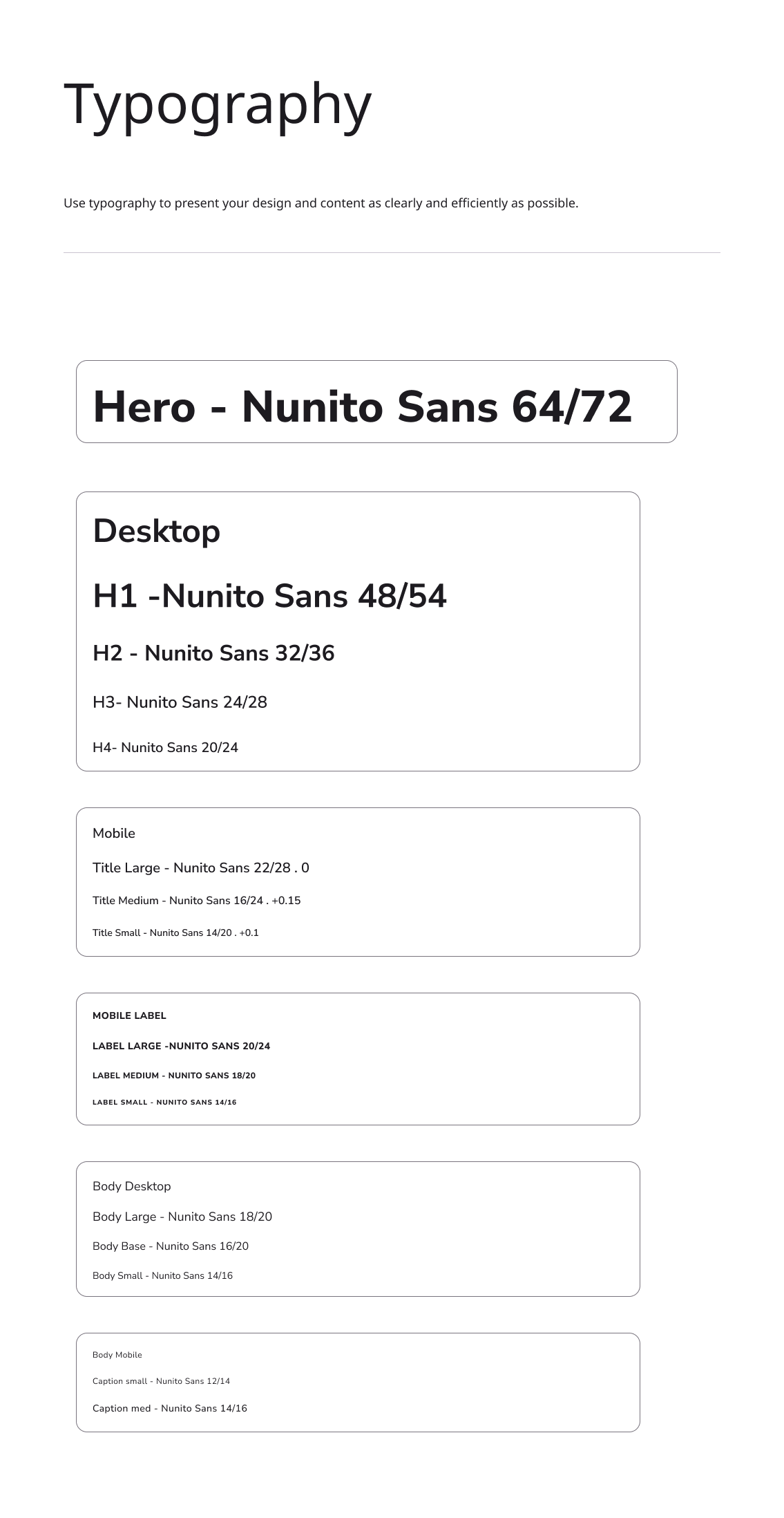
Primary Typeface
Nunito Sans
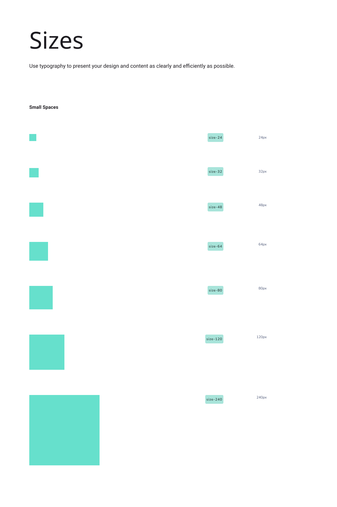
Sizing
Lorem ipsum dolor sit amet, consectetur adipiscing elit, sed do eiusmod tempor incididunt ut labore et dolore magna aliqua. Ut enim ad minim veniam, quis nostrud exercitation ullamco laboris nisi ut aliquip ex ea commodo consequat.
Heros
Type Sizes > 72pt/px
100% Leading
-2% Tracking
Headings
Type Sizes 55–72pt/px
110% Leading
-1 Tracking
Titles
Type Sizes 24–55pt/px
120% Leading
-1% Tracking
Paragraphs & Body
Type Sizes 0–24pt/px
130% Leading
0% Tracking
04 Dimensions
Redo’s voice brings our brand to life through the words we write and speak. The way we communicate with customers has the power to transform their financial well-being. Through clear and intentional language, we make financial corrections simple, accessible, and stress-free. Our direct, approachable, and transparent voice ensures that fixing mistakes feels effortless—so our customers can move forward with confidence.
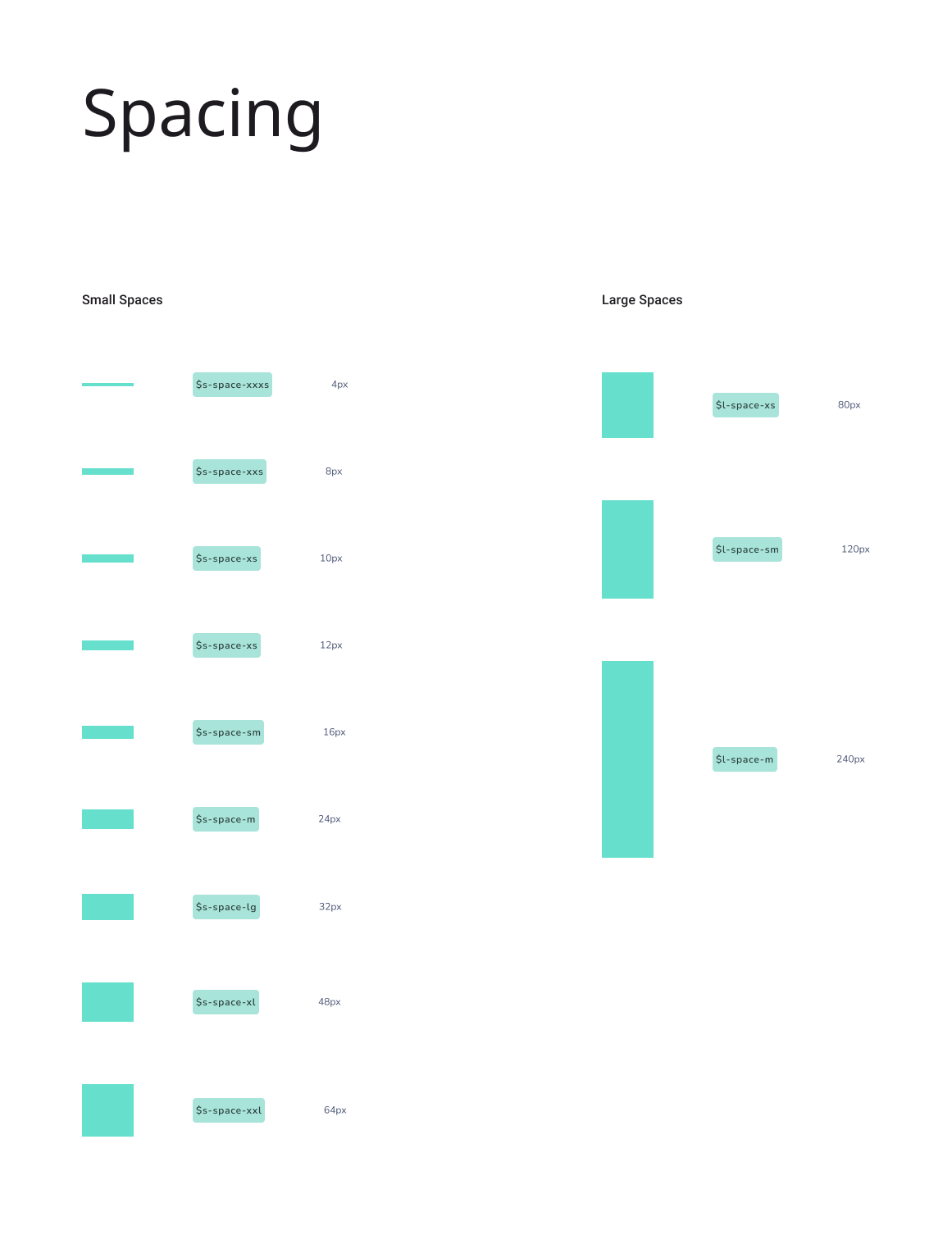
Spacing
Sizing
05 Component
Tokens
Building up the components specifically for the mobile financial literacy app based on use case and necessity using the primitive and sematics defined earlier.

Badge and Notification
Building the badge with typology and surface colors for alerts defined in semantics.
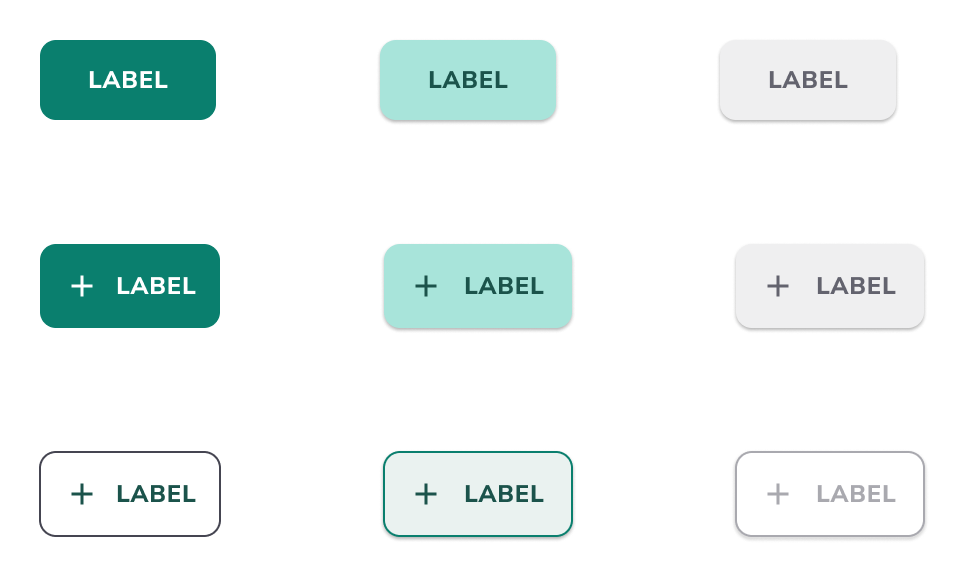
Icon and Buttons
Starting with the define color and icon tokens, the buttons built contain raw, semantic, and component values.
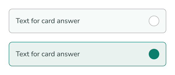
Questionairre Cards
The financial app contains flows requiring user input and selection of quiz answers. Selected and non selected states defined by the established design system.
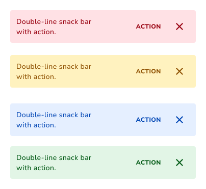
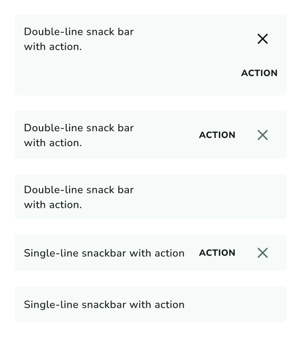
Snackbars and Surface Colorization
Taken from the raw values, the snackbar notification maintain consistent hue, saturation, and tones based on the 10 tone color ramp.
Branded Notification Style
Using text, color, and icon semantics, the notficiation system accomodate various uses cases.
06 Design
Combining all the elements to create designs that are responsive, classified, and make development easier.
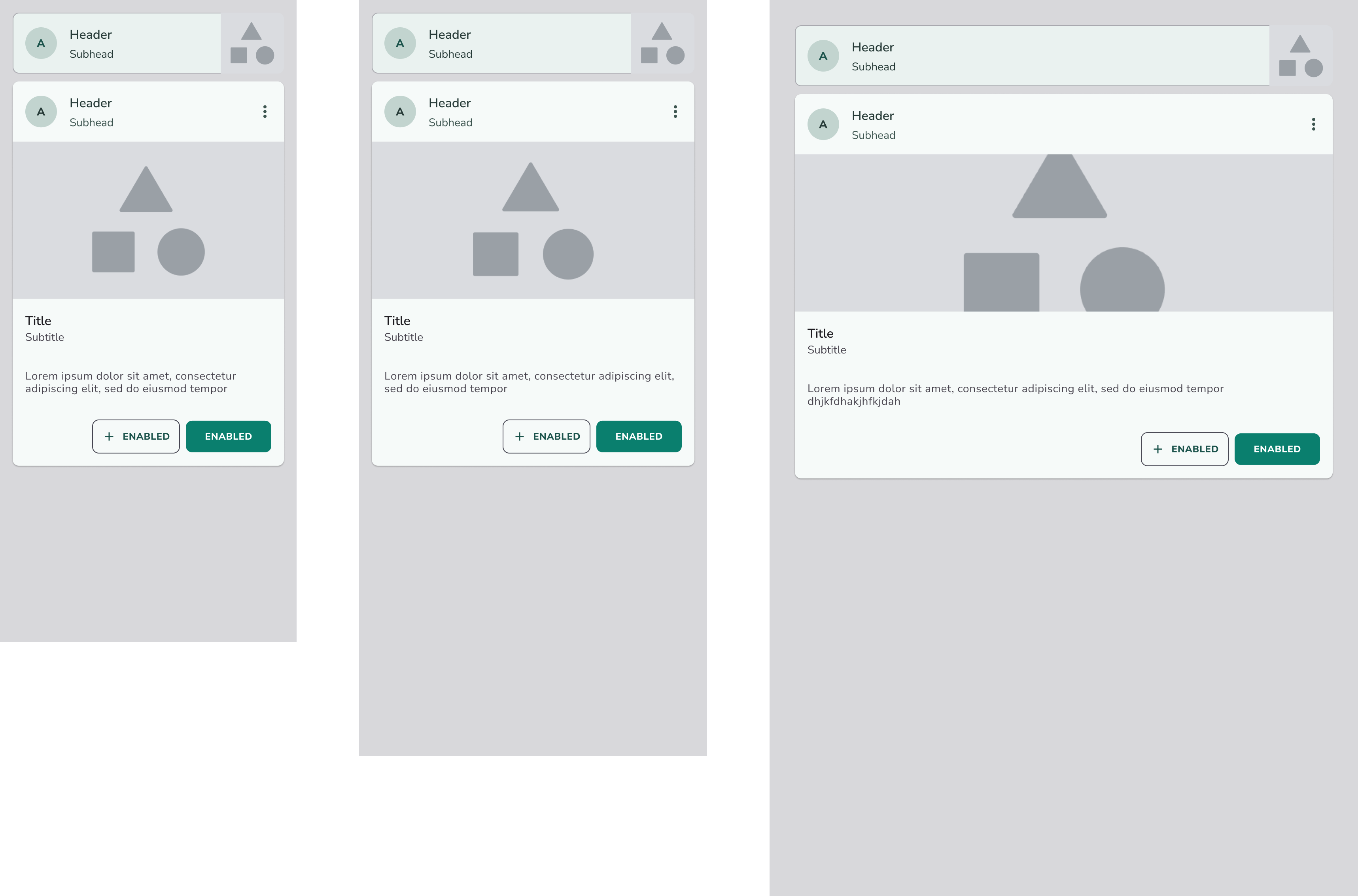
Responsive and Adaptive
Each element and component of the UI library utilizes the design system to conform and adapt to the different device sizes.
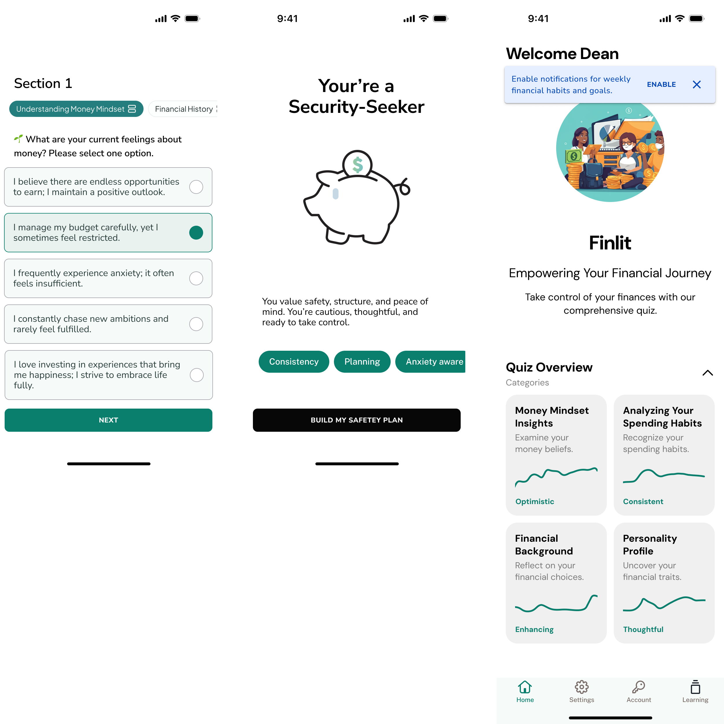
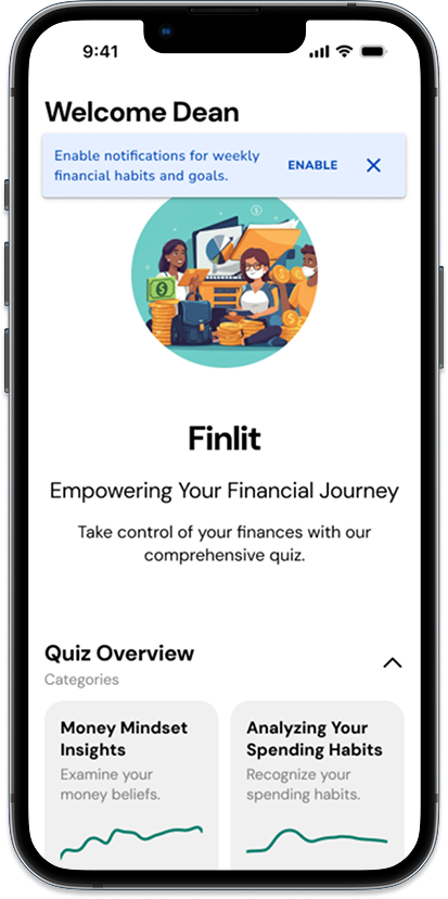
Design System in Action
The financial literacy apps uses personal quizzes to gauge and help users identify the best path to start learning and engage in planning for future money goals.
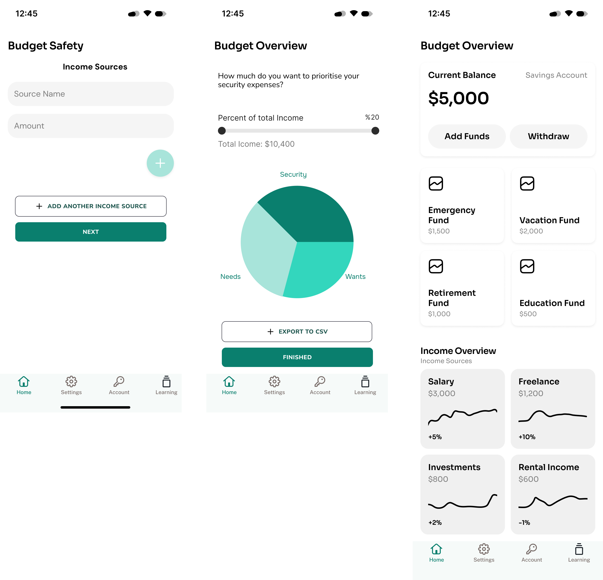
Basic Budgeting
One aspect of the financial literacy app allows users to input and start a budget tracking system to start building healthy money habits and provide financial overviews.
Financial Literacy for Millenials
While I focused on the design system. I created a design pitch deck which dives into foundation research, concept development, and working prototype for providing emotionally based AI for improving literacy and knowlege.